


Building financial confidence
Designing an inclusive financial tool for underserved communities in the UAE.


The brief
Huru set out to tackle a major gap in the UAE’s financial landscape. While the country is one of the wealthiest in the world, large segments of the population remain excluded from mainstream banking. For many, barriers to entry, limited digital tools, and a lack of support for long-term financial wellbeing have left them underserved.
Huru’s ambition was clear: create a mobile-first neobank tailored to an underserved audience. It needed to be intuitive and engaging, while empowering people to take charge of their financial lives.
We were asked to bring this vision to life by designing and building a digital-first app that feels simple, supportive, and made for everyday use.
[Video title]

I really enjoyed working with the fantastic team at Hi Mum! Said Dad. They blended really well with our in-house design experts and, together, helped us shape a transformative experience vision for our customers
Building a bank with purpose
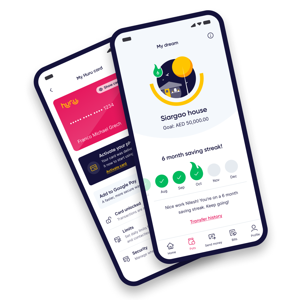
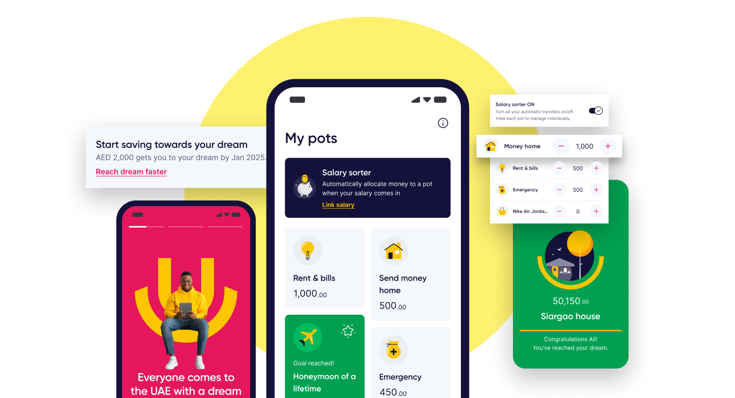
We built a complete neobank from the ground up, structuring complex flows that support everything from international money transfers to salary sorters, bill payments to long-term savings goals.
Importantly, we needed to prioritise the right features and shape an interface that made managing money feel achievable and motivating, without overwhelming users.
Finance can often feel cold and clinical, so Huru needed to feel radically different - human, friendly, and uplifting. We worked with an initial colour palette and expanded it into a full visual system, exploring illustration styles, celebration moments, iconography, and visual metaphors to make sure the brand struck the right balance between playfulness and trust.
[Video title]
Designing for lasting financial habits
Huru’s target demographic were motivated to save, but didn’t always know how, or where to start. To overcome this barrier, we designed a lightweight gamification model that encouraged action through visual streaks triggered by consistent saving.
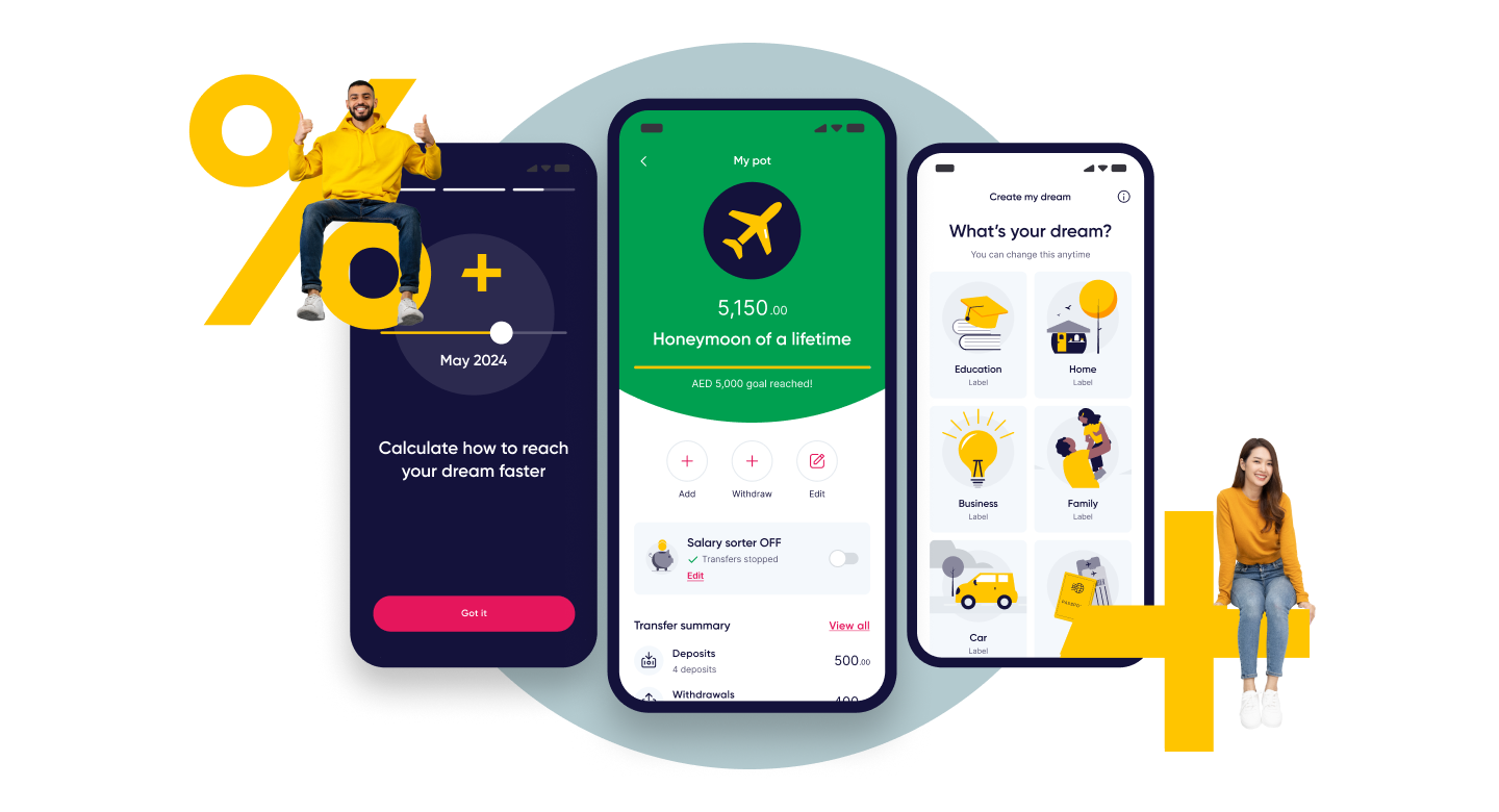
At the heart of the banking experience was the concept of ‘dreams’, long-term, meaningful financial goals that went beyond typical saving. These were often tied to users’ lives back home, such as supporting family, education, or property. We helped shape how to break those dreams into manageable steps, how to show progress over time, and how to create a sense of forward motion.
We explored how users could ‘get there faster,’ with contextual CTAs and clear visual indicators of progress. Every detail, from how pots were displayed to how spending insights surfaced, was designed to make money feel less abstract and more aligned with what mattered most to users.
[Video title]
[Video title]


